The New Yorker's eye-catching upsell
The New Yorker is a weekly magazine with a mix of reporting on national and international politics and culture, humor and cartoons. But because the digital world trumps the paper world, The New Yorker needs to monetize its online content to support the magazine's ongoing journalism. To do this, carefully designed modals are used to convert readers into customers.
Why this is really good UX:
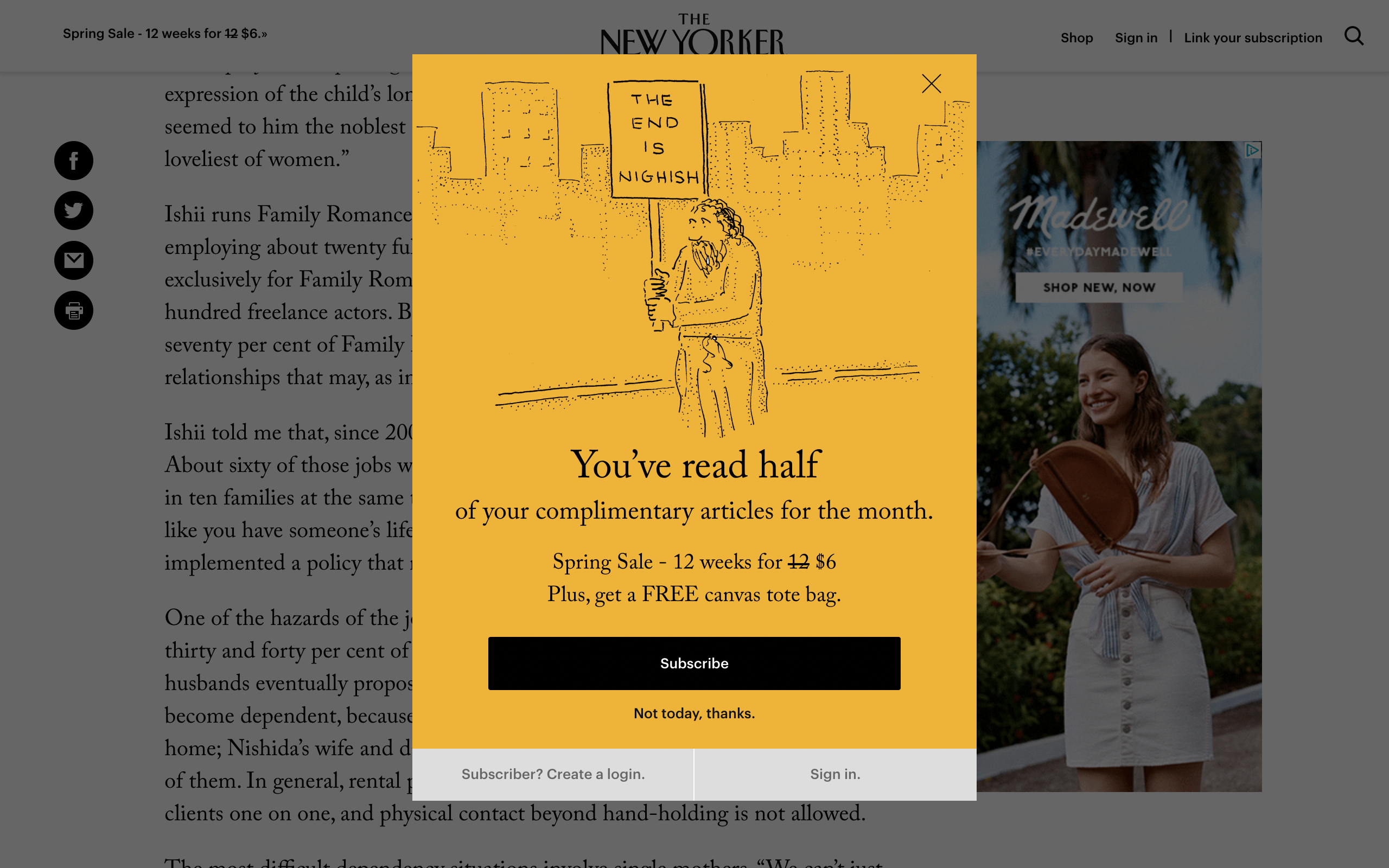
- Users get incessantly bombarded by pop-ups in the digital world. All this noise means users zone out and click to close without a second thought. But because The New Yorker leads with bold color and a humorous cartoon, it breaks the pattern, piques user interest and stops the user from instinctively clicking close.
- The title copy “You’ve read half” is intriguing and encourages the user to take time to read the rest. The copy then takes the user to the sales pitch: a half-price offer with a free tote bag—an attractive deal that warrants the use of a modal.
- Highlighting the free monthly article limit to users creates a sense of scarcity and urgency. When we believe something is in short supply, we want it more; and when we feel like time is running out, we're likely to suspend careful thought and act quickly. These psychological states make users more likely to convert.
- The design acknowledges the different types of users who may encounter this modal. To cater to all, it prompts subscribers to create a login and for existing customers to sign in to avoid the complimentary reading limits.