
Webflow’s 3-step onboarding
Designing a good onboarding experience for your users isn’t always easy, but it also doesn’t have to be hard. Webflow keeps it simple with three UX-enhancing tactics: beautiful UI, personalization, and an engaging product tour. Check ‘em out:
Beautiful UI
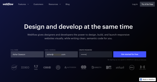
Webflow uses a duotone color gradient as the background here, which creates subtle yet beautiful UI for the sign-up process. Here’s more info on duotones, and why they are effective.
Personalization
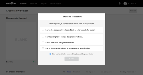
Allow users to make more out of your product by providing a personalized onboarding experience. Plus, learning more about your users is always a good idea. Win-win.
Engaging product tour
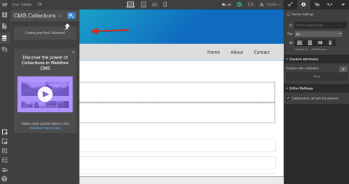
Instead of just saying, “This is where you click to …” Webflow encourages users to take action on their own, which boosts engagement. DIY, would ya? Employing all three of these tactics into your products onboarding experience might be tricky, but if you can manage maybe one or two of them, you’re on your way to really good UX.
.png)
.png)
.png)