
Sprout Social’s activation-focused onboarding
Social media management platform Sprout Social is a robust solution that allows companies to connect their social accounts, uncover trends, manage publishing, and analyze engagement. New users need to connect their social profiles in order to receive value, which means that Sprout Social has to help them overcome a fairly significant bit of friction in order to activate.
And so Sprout Social wastes no time in getting users over this initial hurdle. Their onboarding experience is focused on guiding new users through the process of connecting their social media networks.
Let’s take a closer look at how they accomplish this.
Connecting user accounts
After signup (step 1), users are prompted to attach their social profiles to the platform, starting with Twitter.
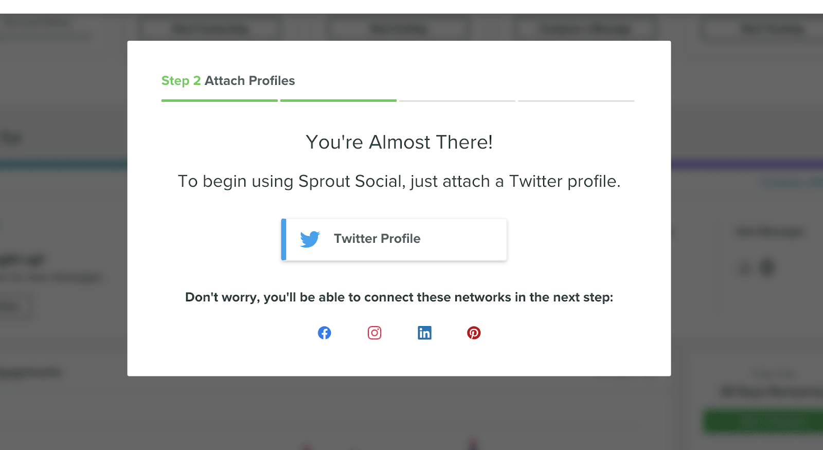
Users aren’t given a whole lot of choice here. Connecting their social networks is a requirement in order to use the app, and Sprout Social makes that clear through their UX: The only way to move onto the next step is to add a Twitter account!
(While we like that Sprout takes some of the guesswork out of this step with a single CTA, it’s not made clear why the first connection has to be Twitter.)
Doubling down on the activation event
If a user declines to authorize their account, they see the following modal:

Clicking “go back” takes you to the initial modal, so both CTAs are really about connecting a Twitter account.
Handling a specific error case from a multi-step flow that happens on another app (Twitter) is good UX to start with. For instance, we got to this modal after clicking through to Twitter, signing out, trying to sign in to a new account but entering the wrong password, eventually getting into the correct account, then declining the authorization, and then clicking to return to Sprout Social.
That’s a lot of opportunities for the initial onboarding context to get lost/forgotten, but it doesn’t—when we got back, Sprout was ready to handle the ‘decline’ situation.
Assessing user needs
After a user has connected their first account, they’re asked for some more information about their experience managing social accounts, and what they’re looking to get out of Sprout Social.

The list of use cases on display here reassures new users that the app is set up to address their need, which could be really powerful input for giving users the specific onboarding they need.
Unfortunately, this step doesn’t seem to inform what comes next—there were no personalized experiences related to our specified use case. It’s possible they showed more guidance than they would for a user who claimed to have more experience. But it didn’t seem like it—we would have liked to see a little more hand-holding after selecting the “I’m new” option.
Demonstrating value with demo data
Sprout Social uses demo data to introduce new users to their reporting dashboards. User can "tour" a realistic version of the product and understand the value prop despite not yet being able to get that value out of their own data.

In order to show the user real insights, Sprout needs not only a connected account but also time and content to track and report on. But this demo view (real app, fake data) does a great job of showing the user what this part of the product does and the value that it provides.
Why this is really good UX:
- Sprout Social’s product works best when a user has multiple accounts connected and when they’ve had social activity reported that Sprout can report on. Those are big hurdles for a new user. Sprout Social’s onboarding ensures that a new user has at least one account connected before they access the product, and their use of demo data makes the app’s behavior clearer despite there being no data yet
- Sprout doubles down on the required step of connecting an account during onboarding. We’d wager that they had a clearly defined activation metric related to number of accounts connected, and they don’t beat around the bush about getting new users to tale that critical action.
Why this really good UX really matters
It’s essential for a product-led SaaS product to convey its value proposition as early and effectively as possible.
This is hard for any application, but in this case the barriers to entry include a high-friction 3rd party integration and the passage of time to show data insights. Without overcoming those hurdles, it’s hard for new users to appreciate the value that Sprout Social provides.
Sprout rightly focuses it’s onboarding on getting folks to take the actions that lead to activation.
What could have been better
- It was never made clear why the first account has to be Twitter. What if a user didn’t have Twitter? Or what if LinkedIn was a much higher priority for them—wouldn’t getting that connected be a lot more valuable to that user? If there’s a good reason for this restriction, it would be helpful for Sprout to provide that context, especially if a user has declined authorization.
- The data that Sprout collected during onboarding didn’t seem to have much of an impact on the steps that followed. This kind of declared data could have been used to personalize and customize the user experience, and provide more tailored onboarding. (If only there was a product that could drive adoption with a more personalized experience…)

.png)
.png)
.png)