
Soapbox’s seamless web experience
Human resources app Soapbox wants to make unproductive team meetings a thing of the past.
On a mission to empower managers to lead their teams effectively, Soapbox is a platform for managers to nurture and coach their employees and help them reach their performance goals. It aims to reduce mundane administrative HR tasks and instead encourage meaningful communication and active team collaboration.
Getting companies to adopt another tool isn’t easy, but Soapbox’s seamless web experience makes it a welcome addition to any team’s tech stack.

The effortless setup process
Getting started with Soapbox is frustration-free. The only sign-up requirement is an email address (and a promise that you are indeed human).

Once you’ve given Soapbox your email, they send over a confirmation email with a link to sign up. It takes only one click to access a new account, so new users are on their way to more productive collaboration in no time.

Clicking the email’s login code directs new users back to the Soapbox website where they can connect their Google or Outlook calendars. A tooltip on the left panel of the page shows how users who don’t want to connect their account to a calendar can bypass that step. But just in case folks miss those instructions, there’s a button below the calendar sections, that leads straight to agenda creation.

The step-by-step guide to creating a meeting agenda
After new users connect their calendars to the app, Soapbox directs them to a page where their events are pre-populated. A tooltip to the right informs new users how to create agendas for the events on their calendar.

When users click “create agenda,” they get a few seconds of downtime as Soapbox creates the agenda. The modal on the screen indicating that the desired content is loading follows a main principle of UX design—“visibility into the system.” This visibility encourages users to be patient and stick around instead of abandoning the product, because they know exactly what is going on behind the scenes as they wait.
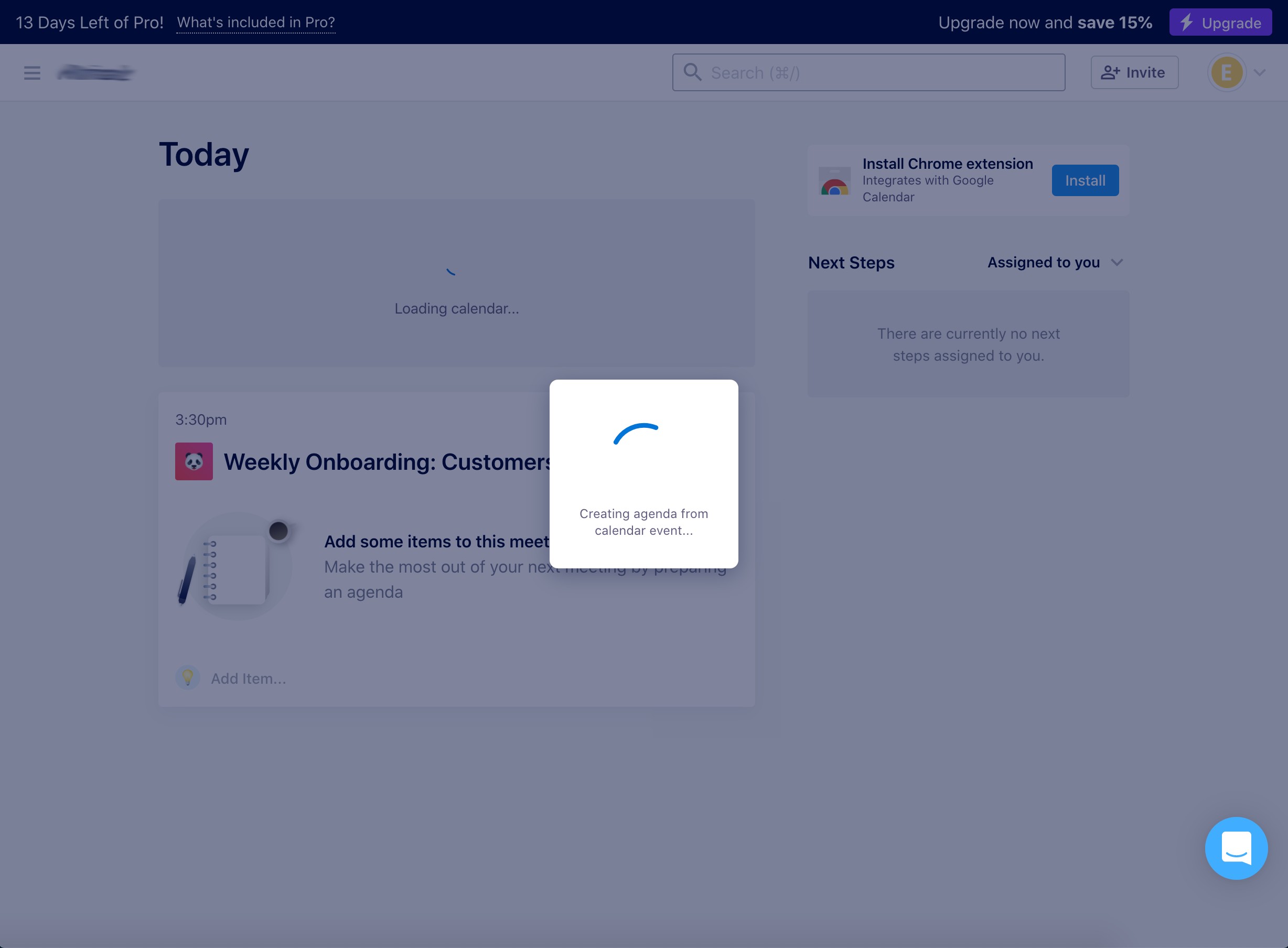
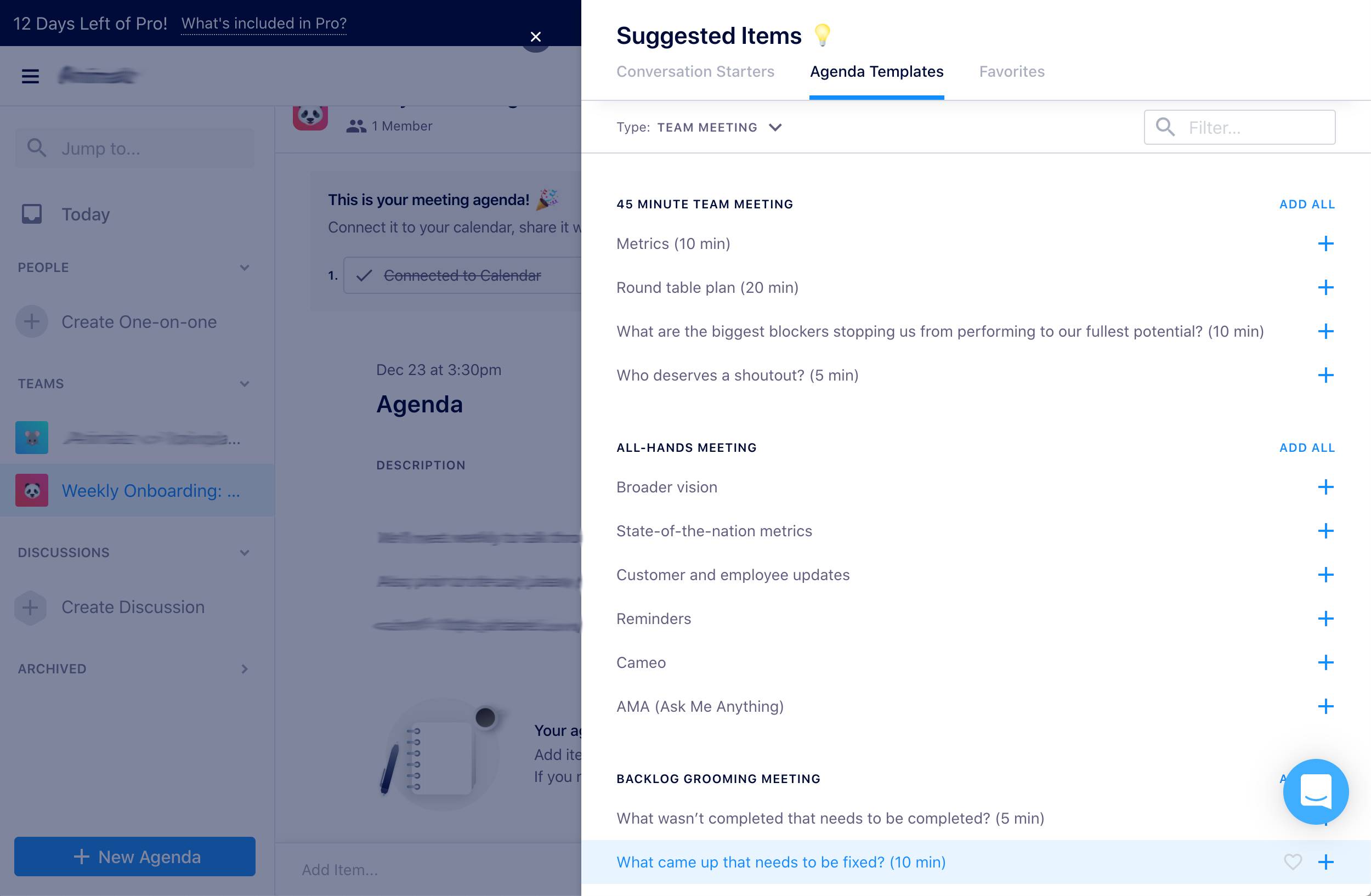
Once the agenda is up, a tooltip on the page lets users know the steps they’ve completed and what comes next. The agenda comes pre-populated with some basic information from the calendar event, such as the event name and description. If users are stumped about which agenda items to add, there’s another tooltip at the bottom of the page with a link to suggestions to get started.

The Suggestions modal comes full of conversation starters and agenda templates for different types of meetings.

The dashboard full of insights
Every agenda has its own dashboard, with navigation tabs to keep users organized. The “Next Steps” tab is where all action items discussed during the meeting go. “Past Meetings” is a section for referencing completed items.
Our favorite tab is “Insights.” On this page, there’s a diagram that displays just how often team members discussed specific topics in past meetings. Using this data, Soapbox lets the user know what work topics they should probably bring up at the next team meeting so that no team member has to endure awkward silences and blank stares. Clever, right?
At the bottom half of the page, Soapbox offers great recommendations for questions to bring up at the next team meeting, as well as relevant articles for meeting participants to read that provide more context about the topic.

As users move from tab to tab in this section, they get different questions and recommended reading relative to the highlighted topic.

The next tab on the Agenda dashboard is “Goals,” which is a premium feature. Clicking on “Goals” triggers an invitation to chat with the Soapbox team. Users can send a message right from the widget, or they can schedule a demo.
We appreciate that Soapbox is upfront about their message response time. People expect immediate responses from companies these days—especially if they’re communicating via chat. By pointing out their typical response time, Soapbox helps manage user expectations.

The last tab on the dashboard is the “Scratchpad.” Instead of taking notes by pen or in a separate app, users can jot down ideas in Soapbox’s Scratchpad. Users can share these with colleagues or keep them private.

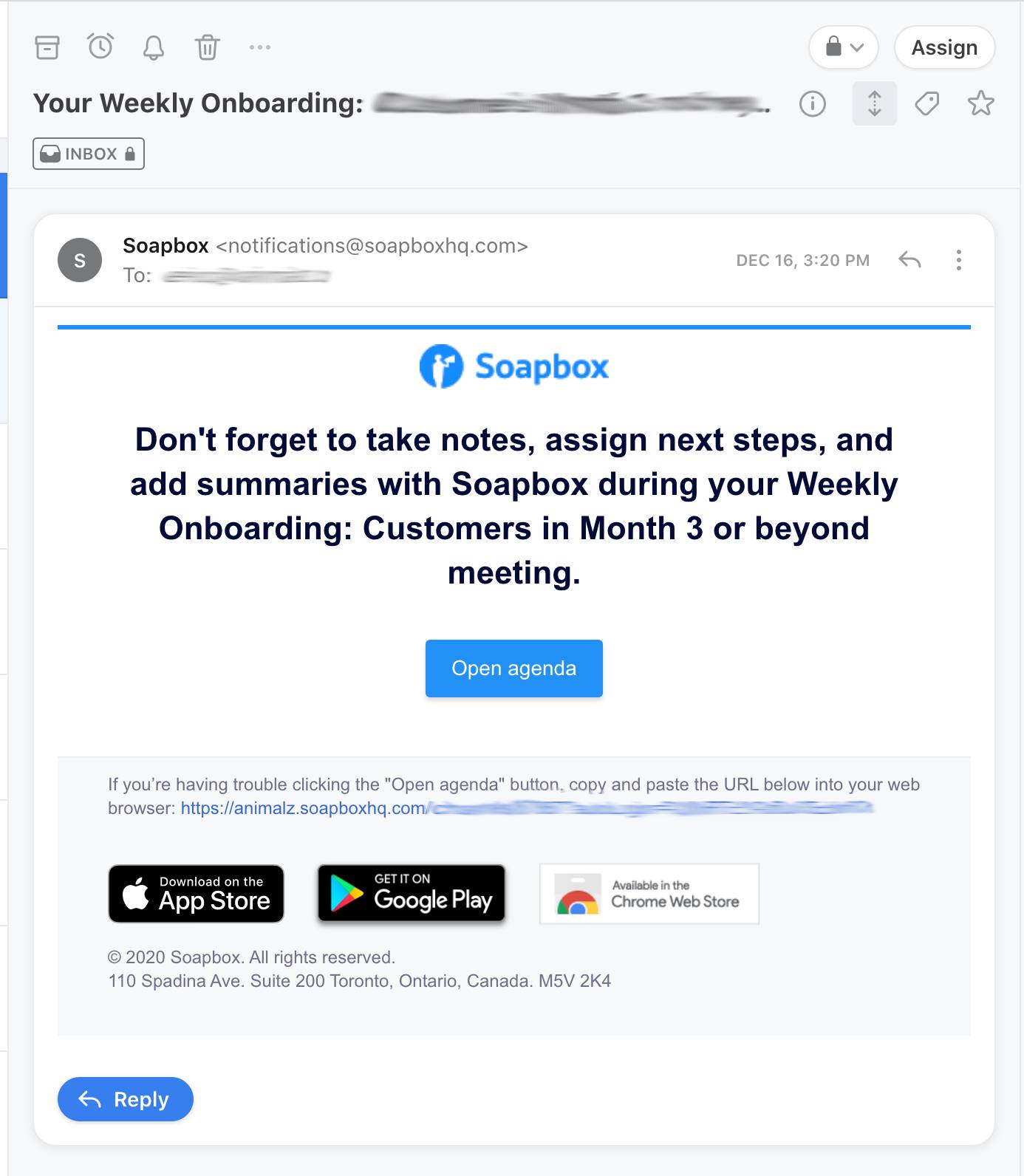
The last-minute reminder to engage
Ten minutes before a meeting, Soapbox sends a reminder to the user about being an active participant in the meeting. Not only is this a great reminder about the upcoming meeting, but it’s a smart way to encourage users to reengage with the app.
What makes this really good UX:
- The setup process is incredibly easy, and Soapbox calls this out to their users. The confirmation email subject line notes a “1-click sign up for Soapbox.” When users get to the initial setup page to connect their calendars, Soapbox lets them know they’re “seconds away” from getting started.
- The Soapbox agenda dashboard has an intuitive design. Everything users need to access for meetings is located in one place, so users never have to navigate too far to find information about the agenda they’re working on.
- Soapbox clearly demonstrates its value with the “Insights” tab. In the diagram that tracks how often performance topics are discussed, Soapbox gives users data to reference, so they reach their performance and collaboration goals. The tab is a space for the after-meeting reflection that often doesn't happen, because people quickly move on with their busy workdays after a meeting.
- The tooltips sprinkled throughout the onboarding process really come in handy for users who wish to create agendas without connecting to their calendars. The extra hints also nudge folks to interact with the different features on the dashboard.
- Soapbox’s email reminders encourage users to have productive meetings and regularly engage with the app.
.png)

.jpg)