
Grammarly's supporting style
Going above and beyond your MS Word spell checker, Grammarly is a tool designed to improve your copy with its advanced grammar rules, contextual spell checker, and vocabulary enhancer. For experienced writers, it can help spot those embarrassing slip-ups, and, for the not-so-experienced, it gives them the confidence to publish and share work with the world.
As a tool, Grammarly is in an interesting position as it has to inform users of what they are doing wrong. To serve its purpose, it has to criticize. And for a user, this is sometimes an uncomfortable experience.
But to counteract the negative emotions that may come from highlighting a user's mistakes, Grammarly uses informative and reassuring feedback to make the experience as pleasurable as possible.


Why this is really good UX:
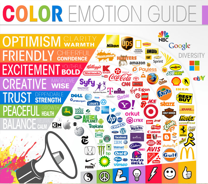
- Maximizing white space with elements of blue and green—often subconsciously associated with peace and trust—creates an aesthetically pleasing and harmonious UI that helps the user feel at ease when Grammarly edits the user's work.
- Micro-animations are used to further influence the user's emotions by offering a visual response once specific actions have been made. It may seem frivolous, but simple, satisfying effects like these enhance the UX and can facilitate a habit that keeps users engaged.
- Complexity and visual noise are minimized by displacing the advanced features such as “document insights” and “set goals” into the side navigation. This way, the majority of users can focus on the fundamentals of getting their writing up to speed, while advanced features are easily within reach for those who require them.


