
Behance's user onboarding: Thoughtful tooltips and practical UX copy
Social portfolio site and mobile app Behance (iOS, Android) connects designers and potential clients through public portfolios and social networking features, making it easy for designers to showcase their work and for potential clients to discover talent. Behance users can vote on works they enjoy (called “appreciations”), create public collections of related work, and quickly share their own projects.

Behance provides a streamlined, easy-to-understand user onboarding experience across both their desktop and their mobile versions. Both interfaces are driven by strong visuals, and straightforward navigational menus and thoughtful copy make it easy for users to find their way around the app's features.
.png)
Behance uses tooltips throughout their app as a way to keep the interface tidy and show descriptive microcopy and social profile details only when relevant.

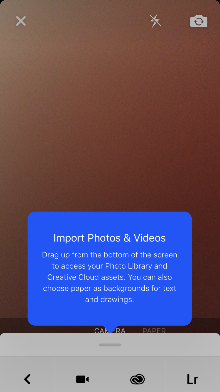
There are also tooltips in the mobile app. For their mobile version, Behance opted for bold background colors and large text to help the tooltips stand out from the rest of the interface.
Hotspots are used throughout the desktop app to highlight key features and gently guide users toward Behance's aha moments—the social sharing and following features of the app.

One small criticsim: White hotspots are difficult to spot against a light background and upping the contrast could increase user engagement.
Behance's thoughtful approach to copy also extends to their permission requests. Their mobile app uses the native request dialog to explain why the app is asking permissions. And the fact that Behance asks for permissions at logical moments gives users context and increases the likelihood that they will grant access.

Why this is really good UX:
- Behance keeps their user interface minimal and free of clutter. The use of tooltips keeps users' focus on the creative work featured.
- Each bit of in-product copy is thoughtfully written, explaining key features in clear language and using descriptive calls to action to make navigating the app easy.
- Hotspots are used to highlight key features and guide users toward the core social features of the app, disappearing automatically once the user has engaged with the feature being highlighted. One caveat: The white hotspots are tricky to see against the white background—Behance could boost user engagement by increasing the contrast.
- The Behance mobile app requests permissions only when required, providing a clear, logical, and contextual explanation for each request and using native request modals to build familiarity and trust.

.png)
.png)
.png)